Our identity encapsulates exactly what we are: a globally-minded university that values close involvement with the social, cultural, and economic life of its city and region or, put simply, a global–civic university with our marae at our heart.
The quality of our teaching and research are the equal of any of the top universities in the world and our graduates deserve to receive the recognition and opportunities that flow from studying at a world-class university.
A distinctive identity is essential to building an international reputation and the cornerstone of identity is place—in our case, the city of Wellington in Aotearoa New Zealand. For this reason, and to reflect the enduring partnership between our University and the capital city, our brand emphasises and celebrates the word Wellington. It also prominently features our new Māori name of Te Herenga Waka.
Our shield and crest also reflect our identity. These elements symbolise the collective purpose of a university community, place us in the harbour city of Wellington, and highlight our long legacy dating back more than 120 years.
Te Herenga Waka
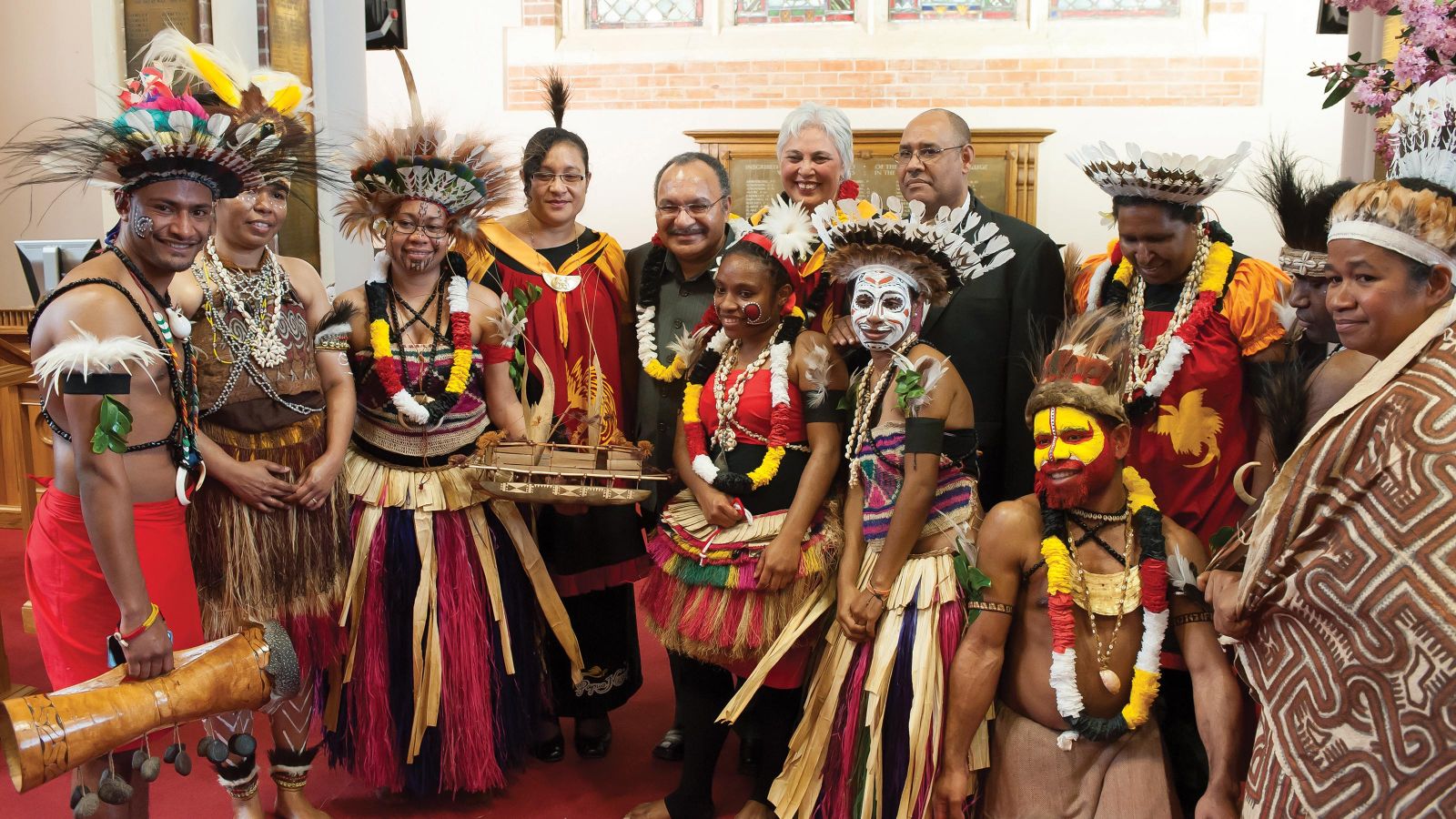
Our Māori name is Te Herenga Waka. This is also the name of our marae and means the mooring place of canoes.
With its fully carved and beautifully decorated wharenui, or meeting house, the first to be established in a New Zealand university, Te Herenga Waka has been at the heart of the University's community for more than three decades.
We are proud of how our marae represents the iho, or essence, of our Māori identity at the University. The centrality of Te Herenga Waka as a place of teaching, learning, and connection makes the University unique. As well as providing a link to our ancestors, it ties us to all the iwi of Aotearoa and across the Pacific. Like the University, it is a place where people from around the country and beyond can 'hitch their canoes' and find shelter. When people are ready to leave the University, they can unhitch their canoe and sail off to new horizons, while still maintaining a deep connection to Te Herenga Waka.
Understanding our logo
Our visual identity has continually evolved throughout our 120-year history, as you will see in the video at the end of the slide presentation below. Different elements of our name have taken prominence in our logo and branding in response to our changing footprint and role in Wellington city. In the slide presentation, you can explore the elements of our visual identity, which celebrates Wellington, our connections to the city, and our bicultural heritage.

Niho taniwha—the teeth of a taniwha
Niho taniwha is a traditional Māori pattern that symbolises strength and unity. The individual triangles are said to depict hapū within an iwi, which are brought together in the pattern to represent unity.
The niho taniwha pattern is found in kowhaiwhai panels at the entrance to the wharenui at Te Herenga Waka, and in tukutuku panels inside. We have used this element in the logo to symbolise collective strength. When the individual triangles are put together, they represent unity, strength, and community.
It is a fitting symbol for the University, where our multiple schools, faculties, and programmes create a whole with a shared sense of collective purpose.
It features a dark-green downward-facing triangle design in three rows: 'niho taniwha', a traditional Māori pattern.
Strategic plan
Victoria University of Wellington's vision is to be a world-leading capital city university and one of the great global–civic universities.
View the strategic planOur partnerships with Wellington
The University’s partnerships in Wellington help drive economic growth, health, and wellbeing, and make the city a better place to live.
View our partnerships
History
The University was established in 1897 and teaching began in April 1899, with 115 students enrolled in the first year.
A global–civic university
A civic university is one that values close involvement with the social, cultural, and economic life of its city and region.

Market research
The findings of the latest market research into the performance of our name reinforce the adoption of a visual identity.
How our logo compares
Each detail of an organisation's logo, from colour to font, conveys an impression. Some universities with British heritage have common elements in their logos, such as a shield and ceremonial crest. Our logo includes this visual symbolism while also celebrating the things that are distinctive about us as a capital city university with a marae at our heart. The gallery below shows how our new logo compares to those of other universities.
